Sunday, September 29, 2013

Blogging Ahead of the Game (Kind of. Not really)

But anyway, here's what we (meaning me) started in class on Friday. I finished it up yesterday, and wanted to blog about it before I forgot.


Obviously the image quality is realllyyyyy good. But I'll scan it in tomorrow and hopefully make up for the fact that this photographs strangely due to the curling of the watercolor paper. 

But anyway, I feel like I didn't really use the whole pick out technique here. I mean, I used it, but it didn't really produce the same effect. There are about a million layers of gouache on each of these apples, which was a lesson in patience as I waited for each one to dry. I also experimented with using different pigments (note: purple) to get different effects as I didn't want to use black except for in the bottom of the basket deal. Also, those white highlights are really awkward, but I didn't know how to approach the highlights otherwise as trying to pick out those highlights just resulted in rubbing the paper raw. And the tape ripped a little bit in the bottom left edge, which was sad. But overall, I kind of liked how this turned out. 

Friday, September 27, 2013

More Pickin'

So here's the next round of gouache using the pick out method. This is supposed to be what we started in class on Wednesday but that one looked awfully horrendous so I started over when I got home. For this one, I used photographic reference of my great aunt Shirley. 


I really enjoyed doing this round of gouache. I chose this photo because there were a lot of highlights and shadows on her face, and I think that translated well in this illustration. I experimented with different brushes and techniques as well. I used a flat brush swept straight across for the arm of the glasses, but used a smaller round brush for the shadow of the glasses because the line was a bit warped across the cheek. For the hair, I used a balled up Kleenex (I was at work and didn't have ready access to Viva #productplacement #notreally) and really liked how it turned out. I know I could work more on this piece and add more detail, but I'm happy with how it looks right now. I also wanted to stick with the whole monochromatic deal, and didn't want to add any other pigment in (also I'm scared that I'll mess it up. But we're working through those fears, right, Rusty?)

Wednesday, September 25, 2013

This Looked Really Good Until ...

I took it to Rusty's office for help.

So it turns out skipping class on the day the demo is done is not the best idea in the world. Apparently.

But regardless, we are now experimenting with the technique of "pick out gouache".

Frustrations with this whole deal:

1. This technique requires patience. I'm not really the best with patience. After perfecting the ratio of gesso to matte medium to water (perfecting = squirting/pouring a bunch of each into a tupperware container and hoping for some kind of balance), I had to wait for it to try before I could lay down any pigment. So there's that. And then once the solution was dry, I had to wait for the gouache to dry. Also, I'm really proud of myself for being able to spell gouache correctly without spellcheck. #smallvictories. Anyway, just getting to what seems like square 1 took a lot longer than I had anticipated. So ... I guess a lesson in patience wouldn't be the worst thing in the world.

2. I followed the directions on the blog in order to learn how to do this technique (and took a little bit of direction from Rusty when I went into his office to whine after I had skipped class) and may have a slight different interpretation of what a "fairly thick" layer of gouache is. Meaning, overall, that my pencil lines didn't show through, and I was kind of just guessing. Which actually turned out kind of cool, because I wasn't bound to that initial framework. But lesson learned: make sure the pencil lines show through. If you're into that sort of thing.

3. I got stuck. Like, really stuck. Like I did the eyes about seven times before giving up and asking for help from Rusty. And this looked really cool before I took it to Rusty's office. Like, really cool. And then I mean I guess it looks okay now and I guess I didn't ignore a crucial component of this illustration. So that's not really a complaint but rather just a PSA that this looked good at one point.

Small (and possibly insignificant) triumphs:

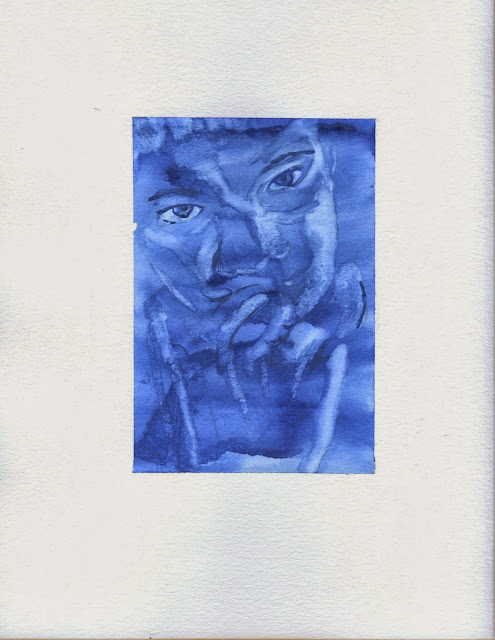
1. I actually kind of liked this. Have you ever had dinosaur egg oatmeal? It was my staple from about grades 1-3 in the morning. Well the cool thing about dinosaur egg oatmeal was that there were these little eggs of brown sugar and when they dissolved in the hot oatmeal, there were little dinosaur sprinkles inside. And that's how I felt doing this assignment ... that I dissolved the gouache with water and a brush and the dinosaur was revealed. Or, in this case, a nose, teeth, some eyebrows ... you get the gist of it.

2. This forced me to look at shadows and highlights in a different way. I looked at the forms in the face in regards to highlights and lowlights and shadows instead of features, and I picked them out as shapes.

3. I did two of these in the event that one turned out horribly wrong. One is definitely preferable to the other. But it's okay.

4. This was overall a cool technique. I suppose. As much as I complained about it, it's cool.


I guess I could now actually show what I was referencing above:

This one here is a picture I took of one of my grandfather's friends. I actually have no idea who this is but I took a picture of him at some point so hopefully he's one of Grandpa Dave's friends otherwise that's real weird.


And my second attempt, a picture I had taken of my brother a few years ago. We don't need to acknowledge that this exists. 


Friday, September 20, 2013

The One Time When We Only Had To Do One

So the paramaters for this assignment was to choose one subject to do a spot illustration that could be used in a promotional piece for Truman. So used a photograph that I had of Kirk Memorial building that I used for reference. 

So thoughts about this assignment: 

1. The problem areas that I had here were the trees and the bricks. About halfway through doing the bricks, I found a new system that I could have used that would have saved me about half the time and about 90% of the effort. But by that point, I was already committed to each and every one of those little rust colored demons. So I just had to go with it. And that frustration is easily seen right in the middle above that little archway thing, as the bricks are larger and more spaced out aka less attention to detail. 

2. So the trees ... I laid down a framework of pencil initially and behind where the trees were to go, I put those pencil markings down a liiiittle too dark. And tried to compensate by laying down more pigment so those circles didn't show through ... and ended up just ruining the whole thing with these blobs of trees. And the pigment is way too heavy for the rest of the piece. But that's okay. I learned from it, right? Right. 

3. I really utilized the "wet on wet" technique in this piece and I liked how it turned out. I was initially (you know, back in the day aka two weeks ago when we learned different watercolor techniques) skeptical of this technique and its practical application, but it's one of my favorite now. I used that for the gray parts and liked how it kind of created a marbled effect. 

4. Detail really makes a difference. There were a few things that I went in later and added, and it made a big difference in regards to contrast and really making this piece what it is. (What? How cheesy is that? Let's pretend that didn't happen.) So anyway, detail = good. 

5. This piece is too big to scan in so we're rocking the always professional phone photo today. Until I get this actually scanned in or decide to take a picture with my DSLR. 


This may be the most beautiful sight I've ever seen. (Rusty's approval, not my illustration)


Wednesday, September 18, 2013

This Is Kind of About Illustration, Right?

Sooo the roomie and I have a guest staying with us this weekend and I have a paper to write ... meaning that Wednesday afternoon was spent cleaning. And our room is now spotless.And since the room is so clean, naturally I have to take pictures of it. Which is almost kind of like blogging about illustration. Also, I haven't started finished my Illustration homework for Friday so I can't even blog about that and since you (meaning Rusty, because I'm pretty sure that's the only person who actually reads this blog besides my mother) were complaining about how the blogs are dry or whatnot, I decided to show off how crafty we are. 

So, without further adieu ... here we go. 

So here we have our lovely nautical door decs #sopreppy


Panoramic view of the room (which I juuuust figured out how to do on my phone #thanksios7)


And here's the most Catholic corner of a dorm room in the entire world. 


So here's the first round of crafts: I had a ton of pictures that I wanted to display but not a ton of room to do so. So I printed about a million pictures (roughly) on cardstock and then printed them in black and white and adhered them to some light green wrapping paper from the dollar store. 

Then came the quote ... which isn't entirely straight so that's kind of ridiculous but I reeeeally don't want to redo it. But I really liked the Mother Teresa quote and just traced some letters on the light pink dollar store wrapping store paper and taped them up on the wall. 

Annnnnd the third one is some little garland deal made up of some twine and triangles from an old Lilly Pulitzer planner that I had. 


Here is the next round of crafts (and by that I mean one craft). Here's a bit more of the wrapping paper, with a makeshift monogram that I did in gouache of a Lilly print that I had.  


And here's my desk, which I just reorganized and I'm really proud of how nicely it's organized now. 


And a closeup of the desk. 


So here's some more work with gouache. I did the middle one over the summer, again inspired by a Lilly print (it's only a little bit of an obsession, it's fine). And then last weekend I decided I needed to do something else with the other two canvases I had .. So I worked in some quotes. Note: Song of Songs 7:7-8 


Just a view of the room from the door. 


We put up tulle and twinkle lights so basically we're living out the dreams we had for a bedroom when we were six. 


And the view from the bathroom door. (Also it's really convenient that my roommate's name is Elizabeth because we can both decorate with E's and it counts for both of us)


Lizbeth (the roomie) went the twine route when it came to displaying her pictures. Which turned out really cool, and then she used a frame to make a collage over her bed of pictures. Also, those curtains are fabric from Walmart + hot glue. #crafty


Also we did this E. And by we I mean I did it. We got a bunch of flowers from the dollar store and cut off the ends (which totally and completely ruined my scissors because I forgot that there was wire ... so that's good) and then hot glued them onto some cardboard.


And here's the final view. I forgot about the orange thing, which says "Your love never fails" which was some Helvetica vinyl letters and some yellow and pink acrylic paint over it, and then pulled off the letters. So basically a mask of vinyl letters. 


Okay I'm going to go get on that Illustration homework now. 


Architecture + Watercolor

So here comes the first round of watercolor and architecture. I chose eight (eight! Two more than what was required! #crazy) photos to use as reference that seemed pretty varied in color/style/level of difficulty.

So thoughts on this one:

I liked the integration of line art in architecture much more than I did for the landscapes. It was nice how the line art forced me to be tighter in my work, and I think that worked to my advantage.

That being said, it made it more difficult to not be as "loose". I think this was mentioned in class, but if I messed up, it couldn't be as easily corrected as everything is a system of lines and shapes. (Which, I mean everything is a system of lines and shapes but we don't need to get into theory or philosophy or anything here.) I think it was harder dealing with that aspect, as everything was already established and at times I felt like I was just filling in shapes with color.

But anyway, here are my architectural line art watercolors:


So these ones are kind of boring. The Catholic church in Edina and a bridge in New York City. I think on these ones I just forgot that detail was a thing? Maybe. Who knows.


Here's the castle at Disneyland and the Catholic church in Novinger (I think I take a picture of every church I visit? I have a lot of pictures of churches. I'm okay with it.) The color of the castle is suuuper weird, as it's all pink and blue and gold on top and then this disgusting gray on the bottom. But I really liked the colors so I integrated those in my illustration. Also, why did I not paint a sky? I have no idea. 

I really like this little illustration of the church though. So there's that. 


Birds Birds Birds


So here we have the two birds that were assigned today. See the first little guy? He looks pretty familiar ... because I didn't do any modifications from class. I really like how the background turned out though, as I just added in pigment and didn't really care where it went. Look at me, I let go of control! (And it actually looked okay, go figure)


And the second is here below. I did these on my 11 x 15 watercolor sketchbook, which is too large to fit in the scanner. So some of it was cut off. I don't really have much to say about this second bird, as I was tiptoeing the line of worked and overworked. Looking back, I definitely could have worked a lot more on this piece without being too "fussy". 
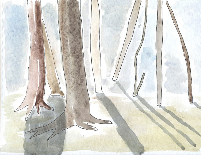


Annnnnnnnd there's also this, which we don't really need to talk about. But I did look up some tutorials and things on how to watercolor with digital painting. Apparently they didn't work. 


Monday, September 16, 2013

Tweet Tweet Fun Fun


Here's what I did in class today ... so far. We'll see where this little guy is on Wednesday. 

A Whole Lotta Watercolor.

The first component of this multi-faceted assignment for the weekend was to illustrate five objects using watercolor. I spent a chunk of time Friday night just working on these while catching up with people (multitasking my homework and my social life ... so incredibly lame, I know). Everything except the two pieces of fruit were from photo reference, the fruit was just playing around with tone. I'm happy with how these turned out, especially in regards to the tree and a few of the flowers. 


So the other part of this assignment was to redo two of the watercolor assignments (at least I thought that's what it was. That's what I went with) with the addition of line art, one with line art first and one after. I kind of forgot about the whole line art thing and did a whole 8 x 10 without any intention of line art. Then I decided I didn't want to add any line art so I just kept it and did two other ones. This is my mind at about 1 am with watercolor brush in hand. 

So here is the one without any line art: 


Here is line art applied before, which I kind of hate. I dislike everything except for the shadows, which are the only things that don't directly relate to the Micron ink. I wasn't really sure what I was doing here, and I think I got frustrated with how "cartoony" this ended up looking. I know I should have picked a different subject matter that would work better with line art, or spent more time planning how I would use these drawings before adding in the watercolor. Overall, I didn't like it. But that's okay. It was a learning experience, right? 


We don't even need to talk about this one. This is line art added in afterwards. 


Hot mess.


Skyscapes

So this post is 1000 years late (roughly) but here are the ten watercolors from the "Skyscapes" or sky-dominant landscapes assignment. I used mostly photographs of a sunrise over Thousand Hills lake (does that lake have a name? No one will ever know). There are also a few photographs that I used as reference from a trip I took to a wilderness island in Georgia ... I needed some clouds to try out my newly learned "Terry techniques" on. 

In regards to budget, I used the full four hours on these ones. I sat down and did the first five or six in about two hours and then did the rest later. This was also kind of an assembly line kind of deal, in which I worked on multiple at once, laying down tone and then waiting for it to dry. 

The top one here I really liked, I enjoyed experimenting with the different techniques. Here I built up layers of tone and then went in with a sponge and dabbled on some texture, and later added in the yellow and orange. The horizon line isn't exactly straight but other than that I'm pretty happy with this one. 

Below is where I tried out my cloud technique, using a paper towel. It works a lot better with a damp paper towel and a little bit of elbow grease, but overall I liked the effect. I also used Terry's technique of filling in the tree tops and leaves and such and then just coming in with a flat brush to do the trunks. 

These were a little rough, I used pure black for the bottom one here when I should have used some kind of a blueish purple deal (to use technical jargon here). I also had a hard time creating a ripple effect on the lake. 

Below is what we call running out of time/patience for watercolor. 


Failed attempt at a palm tree like effect. Sorry, Terry, I have failed you. 


I liked how these sunrises worked out, I experimented with different techniques of creating the sky vs water effect. 


Okay that's all bye. 

What I Did This Weekend Instead of Illustration, Round 2

So it's about 12:30 on Sunday night and I'm just now getting around to doing my illustrations for class in about 7 hours. So that's fine. And as I wait for my watercolor to dry, I decided it would be a good time to use that awkward time to blog about things that have absolutely nothing to do with illustration. Also, I've come to realize that I haven't posted any of my actual illustration work in about a week and I'm really sorry about that and I promise I'll put some up tomorrow, but I just haven't been able to get to a scanner this weekend. Because ... I've been busy with all sorts of things. Which will be illuminated through photography in due time. (aka below)

So this weekend two of my dear friends got married here in Kirksville, and the bride, my friend Ashley (and a former VisCommie herself) asked if I would take a few pictures of the big day. So Friday night consisted of seeing all of my friends who have graduated and are doing cool things with their lives, Saturday was wedding all day (yay Catholic weddings with that awkward Mass vs reception time) and Sunday was editing pictures and trying to catch up on sleep. So with all of that combined ... that means about 0% of my homework was done. So that's great.

But anyway, I thought I'd share a few of the shots that were captured on Saturday:


We settled for an impromptu photo shoot on someone's front steps in between the Mass and the reception:


If you look realllllly close at this one below, third from the left, you'll find a familiar face. Thanks for awkwardly waving to me as I came back from communion, Rusty!