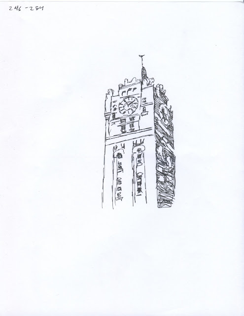
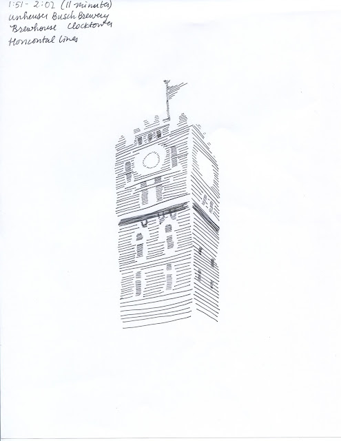
The architecture that I chose was the clocktower of the brewhouse at the Anheuser-Busch brewery in St. Louis. It is one of my favorite buildings and was built in 1891, finished in 1892.
Rusty, apparently you want an "entertaining" blog post. So here are nine fun facts about this building:
1. If you look right under the clock face, you can see two indentations which are pretty difficult to see in this photograph. But those are doors, as there was a balcony that ran around the perimeter of the tower. Adolphus Busch would walk out on this balcony to survey his kingdom.
2. Those pipes on the left hand side are insulated pipes that carry the cold beer throughout the different stages of the brewing and packaging process.
3. The trees are gingko trees. They are Japanese.
4. The street that the brewhouse is on is called Pestalozzi, named after a Swiss education reformer.
5. This is a national historic landmark. (Sorry that's kind of a lame fact, but it's relevant because a portion of the builiding [I believe 50%, but don't quote me on that] must be kept in its original condition. Meaning when you go inside this building, sometimes you expect Adolphus to be walking down the iron lattice stairs. But that's only sometimes.) And, it's one of three national historic landmarks on the brewery property.
6. This is the fifth brewery in the brewery's history, and at the ripe old age of 121 years, it is also our most recent brewhouse. (But not the oldest building on the property)
7. If you look almost to the ground, you can see large concrete openings (I'm not really sure what the word for that is but that's fine). Regardless, this building was once a train depot in which shipments of grains and hops would be unloaded into the depot and brought up to the upper floors of the brewhouse via freight elevators.
8. Those freight elevators have since been converted into passenger elevators and can now hold 12000 pounds each, which is equivalent to six Budweiser Clydesdales per elevator.
9. The elevators also play "Here Comes the King" but only on the way up.
So after reading Rusty's lovely blog post about acquired imagery, I texted my father and asked if he could step outside before he left work (at the corporate headquarters of Anheuser-Busch) and send me a picture of "the heart of the St. Louis brewery". So hopefully you don't get any "nasty emails" from Roland Vonder Haar regarding this photograph, Rusty, but if you do, feel free to forward them my way.
So anyway, here are my sketches. This was challenging in a different way from the first "10 a Day" assignment. It was difficult finding ten different styles that didn't repeat. I did notice that the longer I spent trying to perfect an illustration, strangely, the better it looked. I know it's crazy to say this, but maybe, just maybe, if I don't rush through and assignment and actually take my time, the piece might actually be better! It's such a novel idea.
But I made this realization about halfway through the process, so there's that. Which means that about half of them I kind of half-assed (so does that make it quarter-assed? How exactly does that process work?) because I was trying to figure out what I was doing ... and took my time on the other half. Which doesn't guarantee that spending an hour on something will make it six times as better as something that took ten minutes, but taking my time (the twenty five minutes that were budgeted) and being more careful will definitely pay off.
Also, what I've noticed in this project is that I get burnt out if I sit down and try to do one illustration after another. I get more frustrated with my work if I try to do it all at once, and I experimented with only doing two or three at a time in the two days that I had between class periods and that seemed to work a lot better. So I will probably employ that tactic in the future. Actually I definitely will because it makes me much less insane.
8 minutes
22 minutes
23 minutes
7 minutes
10 minutes
11 minutes
37 minutes
11 minutes
26 minutes
24 minutes


No comments:
Post a Comment