Thursday, August 29, 2013

Line Art (Natural), Round 1

An insight into the process: 

Step 1: Browse through photos on iPhoto, hoping to find the perfect photo to illustrate that will be challenging but not impossible that has the perfect balance of contrast but still intricate detail. 


2. Notice the number in the top right hand side and wonder how that is actually plausible to have that many pictures on one computer and then kind of worry (a lot) that they are all going to be lost in some freak technology accident and have a slight panic attack and then remember that they are all backed up on an external hard drive and then wonder how it's even possible to take that many photos. 


3. Narrow it down to four photos out of 24,490. 

4. Take time out to find the calculator on this computer, divide 4 into 24,490 to get the number .0001633 (and a lot of numbers after that) which is the percentage of pictures I have narrowed down. Take time out just to do this so I can have a cool number on my blog. 

5. Note how cool these pictures are and where they came from, the first being from the Getty in LA, the second from Cumberland Island off the coast of Georgia, the third from the Botanical Gardens in St. Louis, and finally one from the 2011 Knox County Corn Festival. 

6. Talk about the pros and cons of drawing each photo and continue with this lengthy discernment process, to anyone who will listen. (Note: most people stop listening. Or never really start listening)

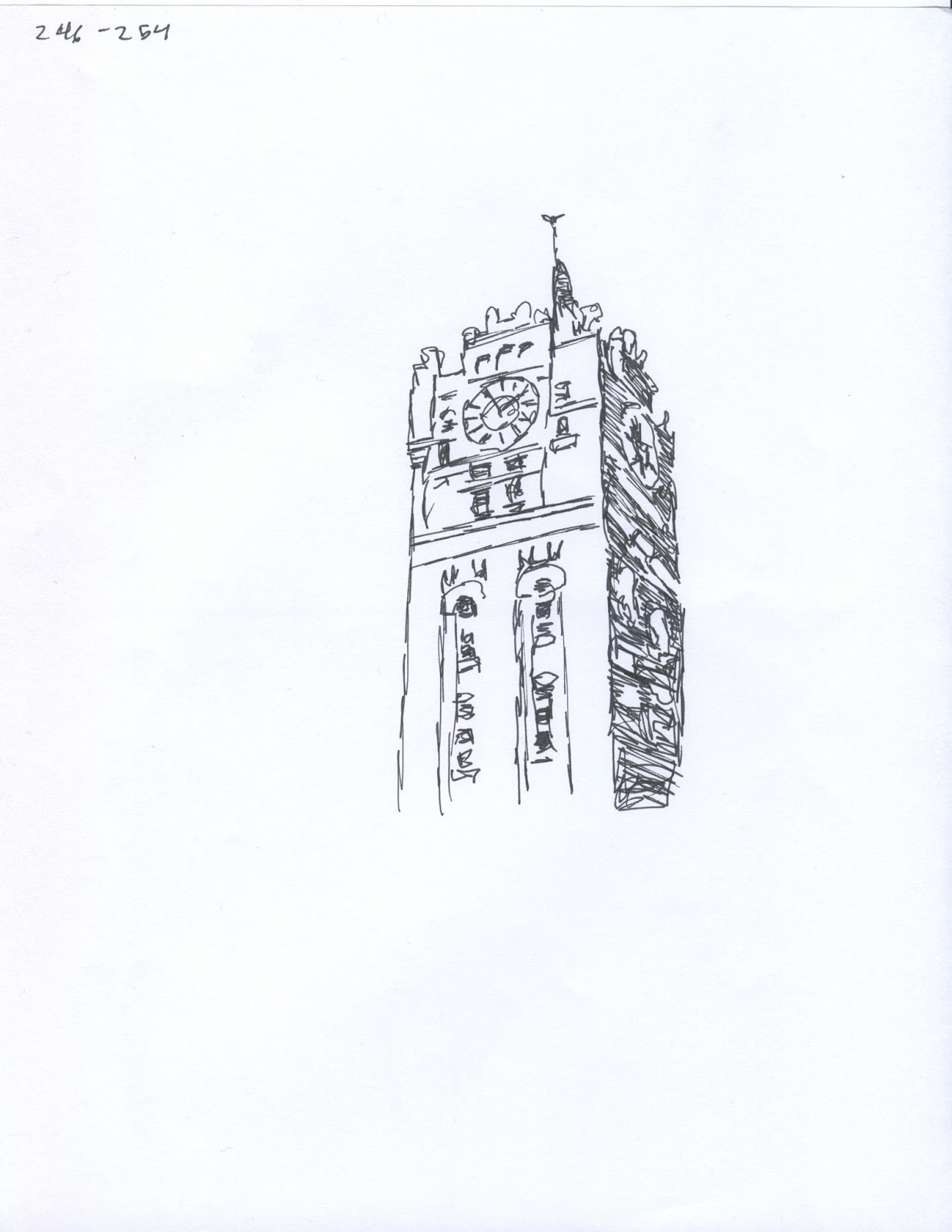
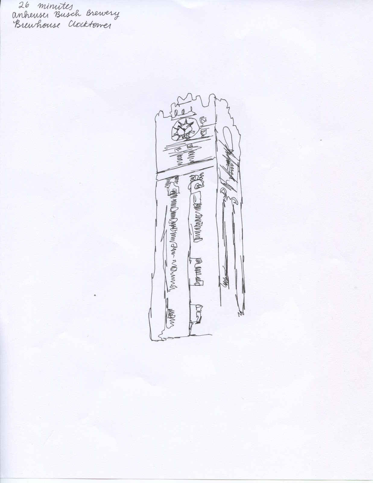
7. Finally choose the first photo, mainly because everyone is tired of hearing me talk about which picture I should choose. And because there's nice shadows and detail and whatnot that will make this a better looking line art drawing. 

8. Put "draw 10 illustrations" on to do list, and heartily intend to get rolling on this whole process the day it is assigned.

9. Laugh, because that for sure didn't happen. But finally begin to do drawings when an ounce of free time is to be had, which just so happens to be during a three hour shift of sitting at a desk and scheduling appointments. 

10. Vow to spend exactly twenty five minutes on each drawing, and ensure this will be done by employing the help of modern technology. (And make it really awkward for everyone when I get urgently called away from the desk for .0002 seconds and my alarm goes off)


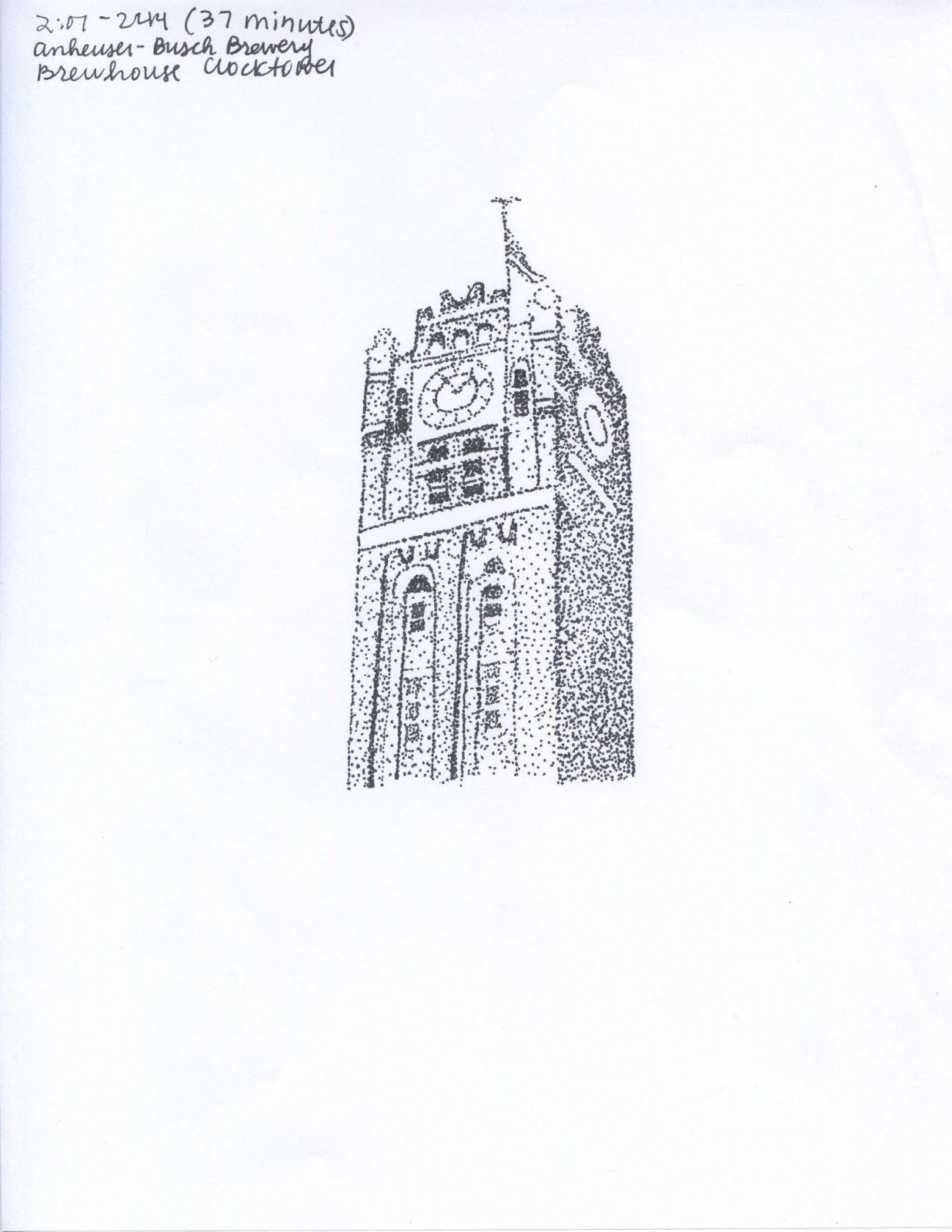
11. Finally start drawing. Start with stippling first: 


because it's doomed to be the most time consuming and generally turns out alright. Use a Micron .05 for this one. 

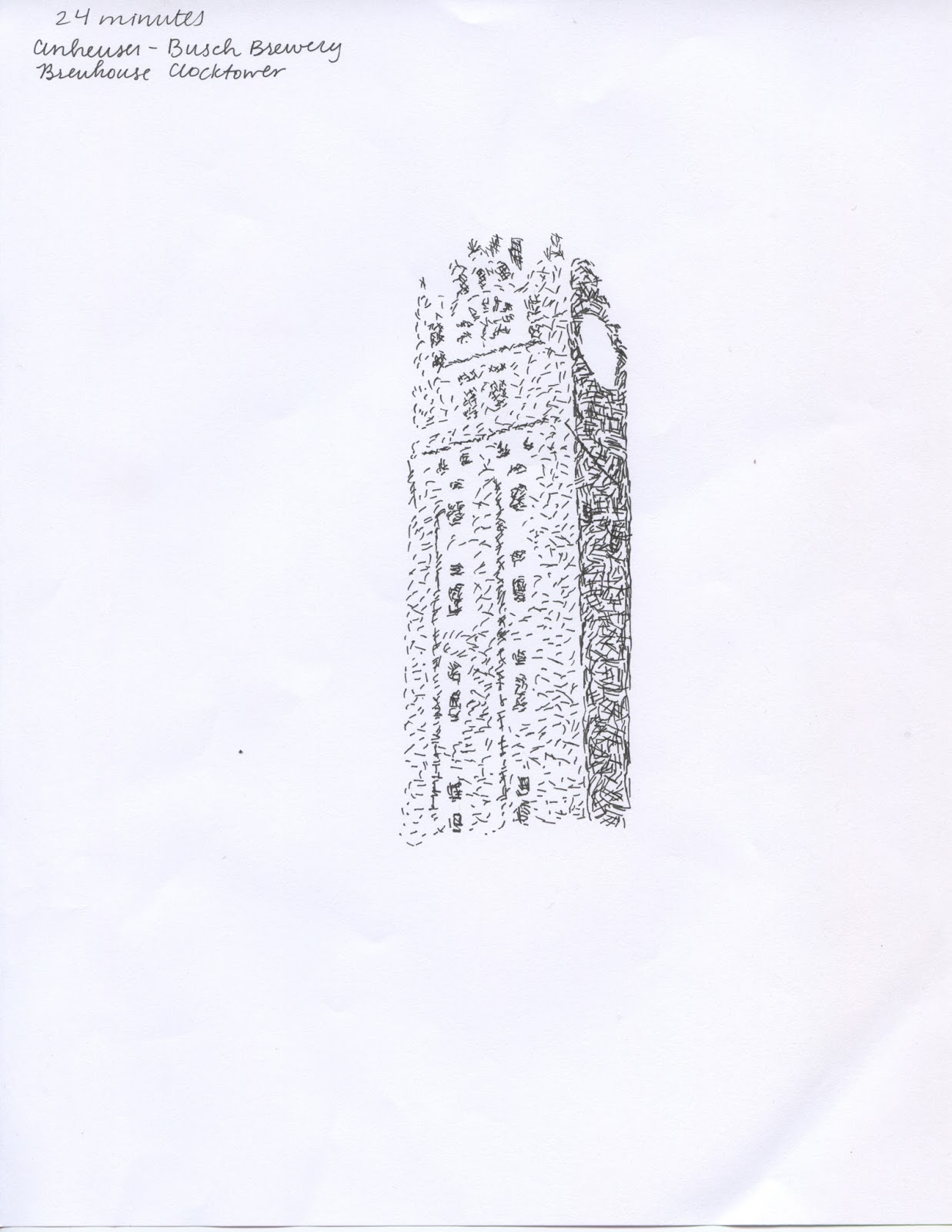
12. Try out horizontal lines/hatching for this one because it seems like a challenge whatnot but hey this is about being adventurous and finding out what works and let's see if that works and jump off the deep end oh my god what am I getting myself into (continue this kind of mental dialogue for the first five minutes or so of this new timer method). Proceed to be almost okay with the turnout because instead of throwing in the towel about 11 minutes in, choose to continue with the sketch and rework it until it looks almost decent. 


13. Marvel at how shitty the lighting is in Kirk building and how there are no windows and it's comparable to what I would think a prison would be like if there was very worn and stained carpet and the possibility of asbestos everywhere. But remember that that's beside the point and I still have eight more sessions of 25 minute timers to set up and plenty of opportunity to shoot better pictures with a real camera or just scan them in like a normal person would. 

And there you have it. That's how this is done. 

Wednesday, August 28, 2013

Line Art Architecture


The architecture that I chose was the clocktower of the brewhouse at the Anheuser-Busch brewery in St. Louis. It is one of my favorite buildings and was built in 1891, finished in 1892. 

Rusty, apparently you want an "entertaining" blog post. So here are nine fun facts about this building: 

1. If you look right under the clock face, you can see two indentations which are pretty difficult to see in this photograph. But those are doors, as there was a balcony that ran around the perimeter of the tower. Adolphus Busch would walk out on this balcony to survey his kingdom. 

2. Those pipes on the left hand side are insulated pipes that carry the cold beer throughout the different stages of the brewing and packaging process. 

3. The trees are gingko trees. They are Japanese. 

4. The street that the brewhouse is on is called Pestalozzi, named after a Swiss education reformer. 

5. This is a national historic landmark. (Sorry that's kind of a lame fact, but it's relevant because a portion of the builiding [I believe 50%, but don't quote me on that] must be kept in its original condition. Meaning when you go inside this building, sometimes you expect Adolphus to be walking down the iron lattice stairs. But that's only sometimes.) And, it's one of three national historic landmarks  on the brewery property. 

6. This is the fifth brewery in the brewery's history, and at the ripe old age of 121 years, it is also our most recent brewhouse. (But not the oldest building on the property)

7. If you look almost to the ground, you can see large concrete openings (I'm not really sure what the word for that is but that's fine). Regardless, this building was once a train depot in which shipments of grains and hops would be unloaded into the depot and brought up to the upper floors of the brewhouse via freight elevators. 

8. Those freight elevators have since been converted into passenger elevators and can now hold 12000 pounds each, which is equivalent to six Budweiser Clydesdales per elevator. 

9. The elevators also play "Here Comes the King" but only on the way up. 


So after reading Rusty's lovely blog post about acquired imagery, I texted my father and asked if he could step outside before he left work (at the corporate headquarters of Anheuser-Busch) and send me a picture of "the heart of the St. Louis brewery". So hopefully you don't get any "nasty emails" from Roland Vonder Haar regarding this photograph, Rusty, but if you do, feel free to forward them my way. 

So anyway, here are my sketches. This was challenging in a different way from the first "10 a Day" assignment. It was difficult finding ten different styles that didn't repeat. I did notice that the longer I spent trying to perfect an illustration, strangely, the better it looked. I know it's crazy to say this, but maybe, just maybe, if I don't rush through and assignment and actually take my time, the piece might actually be better! It's such a novel idea. 

But I made this realization about halfway through the process, so there's that. Which means that about half of them I kind of half-assed (so does that make it quarter-assed? How exactly does that process work?) because I was trying to figure out what I was doing ... and took my time on the other half. Which doesn't guarantee that spending an hour on something will make it six times as better as something that took ten minutes, but taking my time (the twenty five minutes that were budgeted) and being more careful will definitely pay off. 

Also, what I've noticed in this project is that I get burnt out if I sit down and try to do one illustration after another. I get more frustrated with my work if I try to do it all at once, and I experimented with only doing two or three at a time in the two days that I had between class periods and that seemed to work a lot better. So I will probably employ that tactic in the future. Actually I definitely will because it makes me much less insane. 

8 minutes

22 minutes

23 minutes

7 minutes 

10 minutes

11 minutes

37 minutes

11 minutes
26 minutes

24 minutes

Monday, August 26, 2013

Line Art + Wacom Tablet

So I decided to postpone blogging about the line art assignment in order to ensure a high quality reproduction (note: not pictures from my phone) and waited until I had a chance to scan said images. So here are the ten line art drawings:


So here they are. 

I chose a vintage phone to draw, which probably wasn't the best choice. Actually I played around with a few options and either A. this was the least worst (which is a way to describe things, right?) or B. I was fed up with trying to choose an object and went with this. But regardless, here are my drawings. I opted to stylize most of these drawings, but still tried to maintain the basic form of this object. I also played around with different medium. I used Micron pens for a few, fine point Sharpies for a few others, and even broke out the big guns (not really, just black ink) for the two on the bottom. Also, I think the fact that the brand of ink was called "Black Magic" means that these drawings are cursed. Or they're just cursed anyway. These aren't my favorite nor are they my best work, but I think I was challenged by the parameters of creating ten different styles. 

And then ... there's this. 

This is the first time that I've used a Wacom tablet, and I don't entirely hate it ... yet. Here are three of digital vs. by hand: (digital is on the left) 

"Don't worry, these are supposed to suck"

Thanks Rusty. 


Thursday, August 22, 2013

The Calm Before the Storm

Welcome, welcome to the illustration blog. Due to the fact that I have a scholarship desk job and zero homework from the one class I had today, I decided to get a head start on the inevitable blogging of the semester. So, without further ado, here are seven quick takes in the calm before the storm. 

1. I'm super excited about these illustration supplies. I may have bought all of my supplies at a Black Friday sale at Blick last Thanksgiving. I may have been super impatient and broken out 90% of the gouache and watercolor. Just possibly. 


2. Painting with gouache + floral prints makes me feel like a Lilly Pulitzer print designer. I stayed with a few old friends last week while they were furnishing and decorating their new apartment, and as a thank you for their hospitality I made them some new decorations (matching each of their color schemes, of course) for their new rooms. 


3. I'll finally be able to spell gouache correctly. Without spell check, hopefully.

4. 7:30 classes are growing on me. Or at least I keep telling myself that. Between Illustration and Sculpture I, I will be waking up every morning at 7 am. So that's good. 

5. I'll have an excuse to spend time on Pinterest looking up illustrations. 

6. I have high expectations for this semester. But reasonable expectations as well. Learning from past semesters (actually just one), I plan to diligently budget as well as record my time. 

7. I can't wait to begin to chip away at those 10,000 hours! See, Rusty, I do read your blog.